September Wedding Colors: 20 Palettes for Early Fall Weddings
September is the summer-to-fall crossover month. Sage and terracotta, dusty blue and peach, lavender and gold: find the palette that fits your still-warm, transitional day.
Share Your Wedding PhotosTop September Wedding Color Palettes
Six curated palettes that capture the transitional warmth of September, from the first weekend to the last.
Sage + Terracotta
The defining September palette: earthy warmth meets garden freshness.
Dusty Blue + Peach
A mixed-temperature palette that photographs beautifully in September light.
Lavender + Antique Gold
Romantic and warm, ideal for evening ceremonies.
Dusty Rose + Warm Ivory
A soft, feminine palette with warm neutral grounding.
Rust + Cream + Olive
For late September weddings when fall is fully arriving.
Mauve + Sage + Gold
A sophisticated three-way palette for garden venues.
Week-by-Week Color Guide for September
September weather shifts noticeably across the month. Your date within the month should influence your palette.
Early September (1-10)
Avg Temperature
75-85F
Light Quality
Still bright summer light
Best Palette Choices
Dusty blue, peach, soft sage
Feels like late summer; avoid heavy fall tones
Mid September (11-20)
Avg Temperature
68-78F
Light Quality
Golden warm with longer golden hour
Best Palette Choices
Sage, terracotta, lavender, warm ivory
Peak transitional window; widest palette range
Late September (21-30)
Avg Temperature
62-72F
Light Quality
Rich golden afternoon light
Best Palette Choices
Rust, olive, mauve, antique gold
Deeper tones begin working; still avoid heavy burgundy
Late-Summer Garden Florals That Define September Palettes
September gardens are at their fullest before the first frost arrives. These blooms are peak-season and priced below their out-of-season counterparts.
Dahlias in bloom
Peak season. Cafe au lait, coral, and burnt orange dahlias map directly onto the sage-terracotta palette.
Late sunflowers
Warm gold faces pair with terracotta and rust. Use as bouquet focal flowers or ceremony arch accents.
Garden roses still strong
Creamy, blush, and apricot garden roses extend the summer feel into the palette without looking out of season.
Asters beginning
Purple and blue asters start appearing in mid-September, making dusty blue and lavender palettes florally achievable.
Zinnias and marigolds
Bold coral, orange, and gold zinnias give terracotta palettes textural depth in arrangements.
Amaranth grasses
Burgundy and terracotta amaranth grasses add movement and warmth to bouquets and centerpieces.
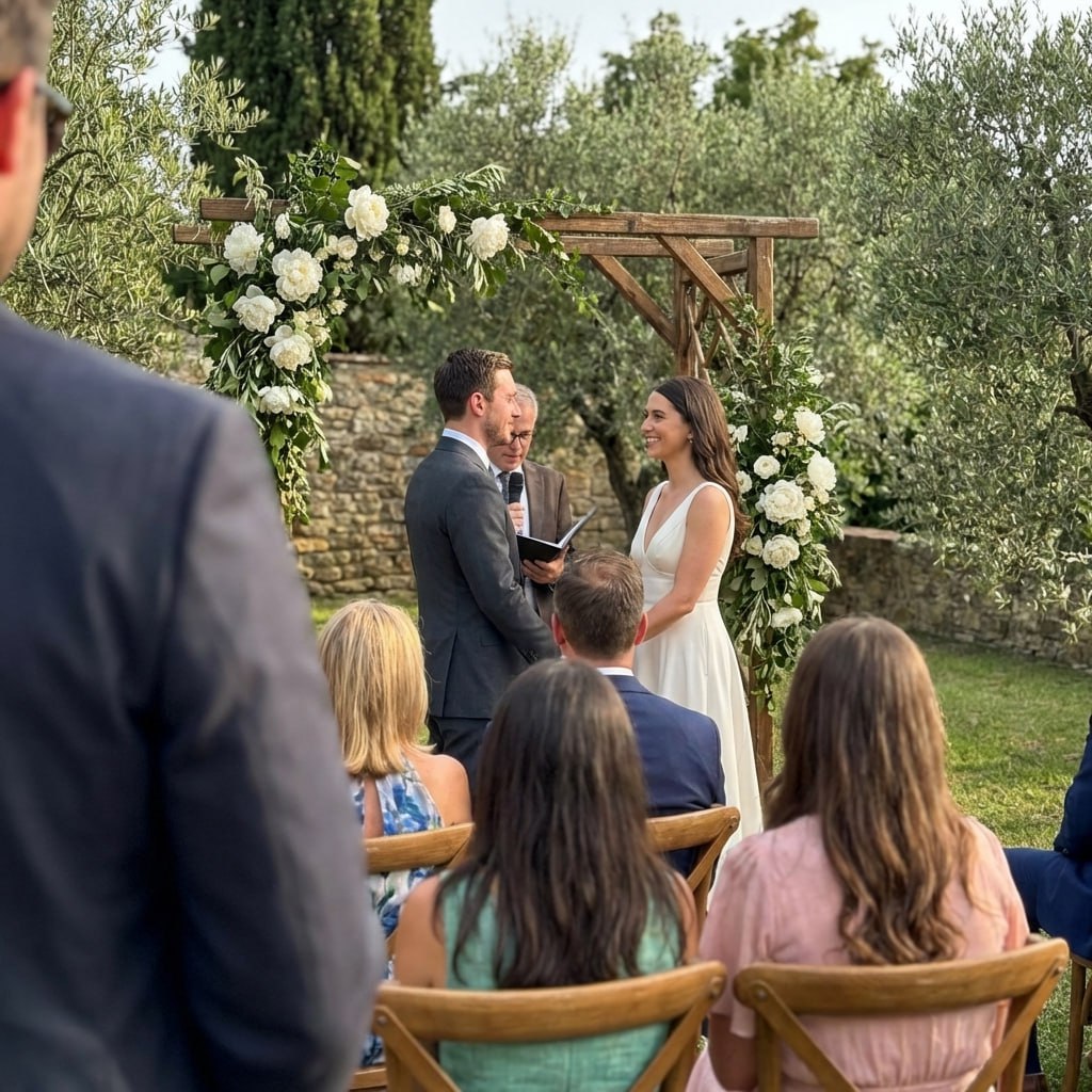
Deep Dive: The Sage and Terracotta September Palette
Sage and terracotta is September's signature combination: warm clay earth tones anchored by cool muted green, photographed in golden early fall light.
The Full Palette Breakdown
Sage Green #87A68A
Dominant: bridesmaid dresses, table linens, ceremony arch foliage
Terracotta #C1694F
Secondary: florals, candles, clay-pot centerpieces, ribbon detail
Warm Linen #F5ECD7
Neutral anchor: table linens, stationery, invitation paper
Antique Gold #C9A84C
Accent: hardware, candle holders, charger plates, ring detail
Where to Apply Each Color
The Dusty Blue and Peach September Palette
A mixed-temperature palette that balances the cool clarity of late summer with the warm softness of approaching fall. Particularly striking at outdoor venues in late afternoon September light.
Why it works in September
Dusty blue reflects the still-clear September sky while peach echoes late-harvest orchard warmth. The combination avoids the heaviness of pure fall palettes while feeling more intentional than full summer pastels.
Floral pairings
Asters (naturally blue-purple), ranunculus in apricot, cream garden roses, dried pampas grass. These flowers are all peak-season and affordable in September, making this palette budget-friendly without looking it.
Photography behavior
Dusty blue absorbs September afternoon light without washing out, and peach adds warmth that makes portraits glow. The palette avoids the over-exposed look that can happen with pure white in bright September sun.
Venue match
Particularly strong at vineyard, garden, and coastal venues. In urban hotel settings, pair with brushed gold metallic details to ground the palette and prevent it from reading too casual.
Lavender and Antique Gold: The Evening September Palette
September evenings cool quickly and golden hour arrives earlier than in summer, making candlelit evening receptions particularly atmospheric. Lavender and antique gold take full advantage of this window.
Ceremony timing
Plan ceremonies for 5:00-5:30 PM in September to catch the softest golden light. This palette glows particularly well in that window.
Photography tips
Ask your photographer to shoot portraits during that golden hour window. Lavender in September light looks richer than in the harsh midday sun.
Floral choices
Statice, lisianthus, sweet peas, and late lavender harvest blooms. Pair with champagne-colored roses and dried wheat for the gold accent.
Decor application
Gold candlestick holders, ivory taper candles, and lavender ribbon on pew ends. Mauve napkins folded into gold rings complete the look.
Colors That Do Not Work in September
Just as important as knowing what works is knowing what to avoid. These palettes look seasonally mismatched in September.
Deep burgundy and wine
Burgundy belongs in November and December. In September, it reads as premature. If you love the color, wait for late October at the earliest, or use a lighter mauve substitute.
Pure icy whites
Crisp white is a summer color. In September, warm ivory and linen whites look far more intentional against the earthy backdrop of transitional venues and garden settings.
Dark hunter green
Deep hunter green reads very Christmas-adjacent and feels heavy for September temperatures. Swap it for sage, olive, or eucalyptus green for the same botanical feel without the visual weight.
Bright tropical brights
Hot pinks, turquoise, and tropical yellows conflict with the September color story. These are firmly summer colors and will look out of place as leaves begin their turn.
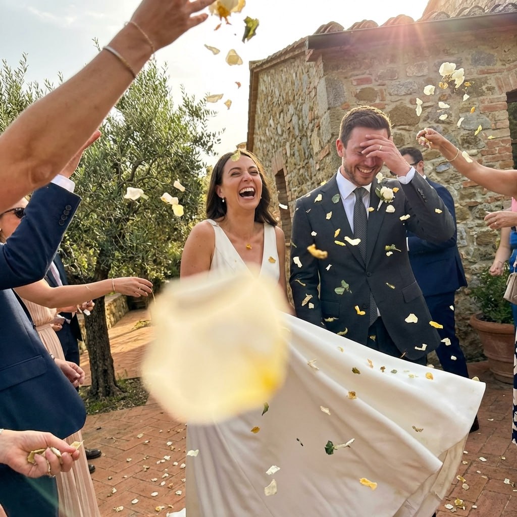
How to Photograph September Wedding Colors
September light is a photographer's favorite: warm, directional, and present for longer than summer's harsh midday. Use it deliberately with these tips.
Golden hour timing
In the continental US, September golden hour typically starts around 6:00-6:30 PM EDT and 7:00-7:30 PM PDT, since the country is still on daylight saving time. Schedule portrait sessions 30 minutes before sunset for the warmest light.
Sage and terracotta in direct sun
These earthy tones handle direct September sunlight without washing out. Ask your photographer to shoot in open shade for portraits but in full sun for detail shots of flowers and decor.
Edit style recommendations
For sage and terracotta palettes, a warm film-inspired edit with lifted shadows and golden highlights preserves the earthy tones. For dusty blue palettes, a slightly cooler, airy edit with preserved blues works better.
Sharing guest photos
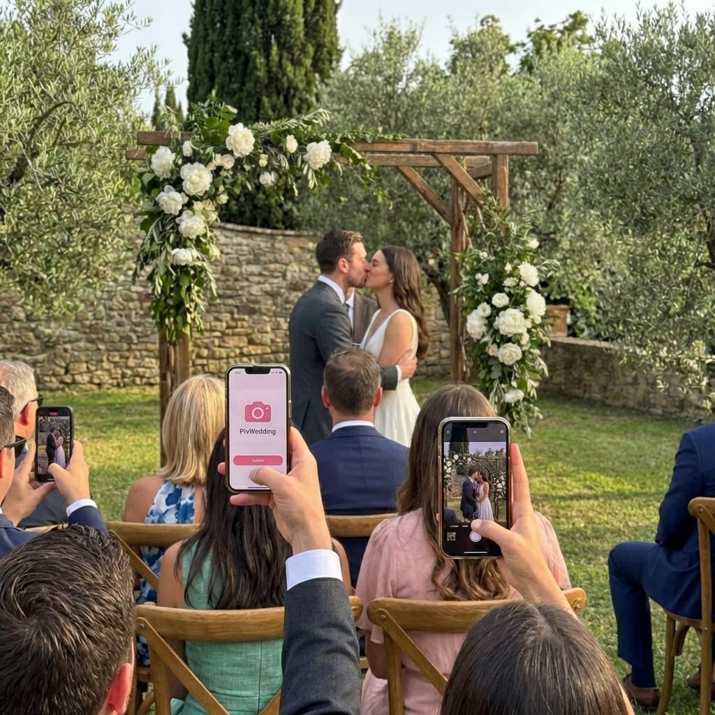
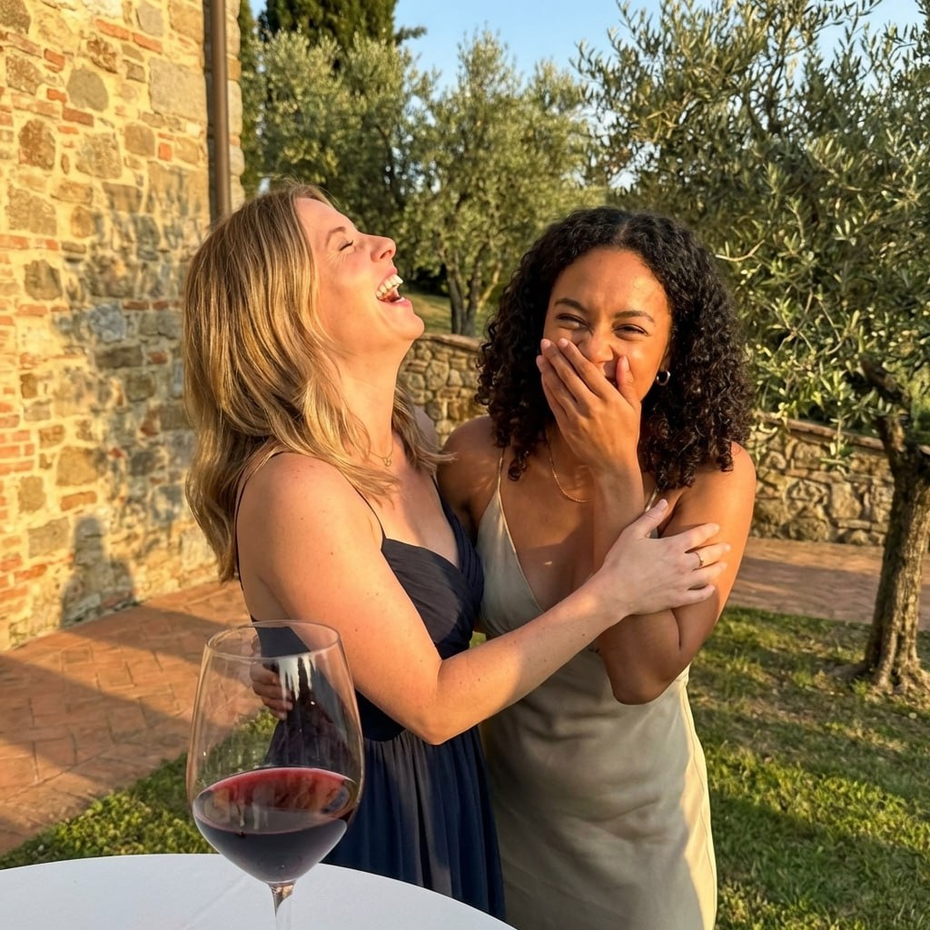
September weddings generate beautiful candid shots from guests capturing golden afternoon light and garden settings. Use Pix Wedding to collect all guest photos automatically in one shared gallery.
September Wedding Budget: How Color Choices Affect Cost
September color choices have real dollar implications. In-season flowers, seasonal fabrics, and timing all shift the overall wedding budget in meaningful ways.
In-season floral savings
Dahlias, zinnias, and sunflowers are at peak abundance in September, meaning wholesale prices are at their annual low. In-season blooms typically cost significantly less than the same variety out of season, since dahlias and zinnias are essentially unavailable from domestic growers outside their summer-to-fall window and would need to come from greenhouse production at a real premium.
Fabric pricing by season
Chiffon and lightweight crepe, the ideal fabrics for September bridesmaid dresses, are also lower-cost fabrics than velvet and heavy satin. Choosing September means the practical fabric choice is also the budget-friendly one.
Venue pricing in September
September is peak wedding season, which means Saturday venues command premium pricing. Many venues offer meaningfully lower rental rates, often in the 10-25% range, for a Friday evening or Sunday afternoon ceremony with the same September aesthetic and guest experience.
Photography in September light
The extended golden hour in September (compared to summer) gives photographers more time in the best light, reducing pressure on the timeline and often resulting in more keeper images per hour of shooting.
September Wedding Color Planning Checklist
Use this checklist as you finalize your September palette and coordinate with vendors.
Confirm your wedding date window (early, mid, or late September) and select the matching palette tier
Order color swatches in your top 2-3 palette options and view them in natural daylight outdoors
Share swatches with your florist to confirm September availability of featured blooms
Match bridesmaid fabric choice to expected September daytime high temperature at your venue
Request your photographer confirm they have experience with sage and terracotta palette editing
Plan outdoor portrait session for 45-60 minutes before sunset on your date
Select metallic accent (gold, antique gold, or copper) and apply consistently across linens, hardware, and stationery
Confirm that all fabric and floral orders are placed at least 16 weeks before the wedding date
Test your full palette in venue lighting if your reception is indoors: warm ivory can read yellow under certain ballroom lighting
Brief your DJ or band to match ambiance to the palette: garden acoustic for sage palettes, warmer jazz for terracotta
Related Wedding Color Guides
September Wedding Stationery and Signage Guide
Stationery establishes the palette story before the wedding day arrives. These September-specific choices keep the color story consistent from invitation to welcome sign.
Invitation paper and ink
Warm linen or cream card stock with sage or terracotta ink. Antique gold wax seals add the metallic accent without overpowering the softer palette. Letterpress printing enhances the earthy texture of linen paper.
Welcome and directional signs
Wood slice or reclaimed plank signs with hand-lettered calligraphy in dark walnut or black ink, wrapped with eucalyptus and dried fall grasses. Avoid foam board or glossy laminated signs, which undercut the natural aesthetic.
Menus and place cards
Sage-colored card stock with terracotta calligraphy, or dusty ivory cards with sage ink and a pressed flower accent. Cloth or linen envelope liners in a warm botanical print add dimension to the invitation suite.
Table numbers and escort cards
Terracotta clay discs with etched table numbers are a distinctive September detail that ties directly to the color palette. Natural wood rounds with painted sage numbers are a budget-friendly alternative.
Transitioning Your September Palette from Outdoor Ceremony to Indoor Reception
Many September weddings have outdoor ceremonies and indoor receptions. Your palette needs to read cohesively in both settings and lighting conditions.
Outdoor ceremony
Light
Natural warm afternoon sun
Palette Behavior
Sage, terracotta, and linen shine in natural light. Avoid very light tones that wash out in bright sun.
Styling Tip
Sage bridesmaid dresses with terracotta floral ceremony arch. Linen ribbon on pew ends.
Cocktail hour transition
Light
Dusk to early evening
Palette Behavior
Golden hour is most flattering for the full palette. This is the portrait moment for warm antique gold and sage combinations.
Styling Tip
Schedule group and couple portraits during cocktail hour for the best transitional light.
Indoor reception
Light
Warm ambient and candlelight
Palette Behavior
Terracotta and gold deepen beautifully under warm candlelight. Sage may read slightly more muted indoors, which is corrected by pairing with ivory linens.
Styling Tip
Use warm 2700K bulb lighting only. Cool white lighting fights the warm September palette.
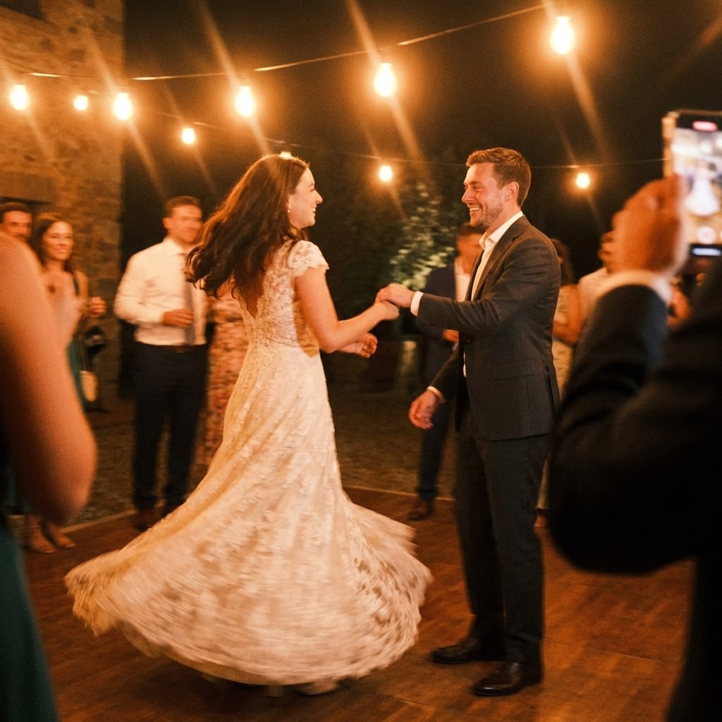
First dance
You guys!!
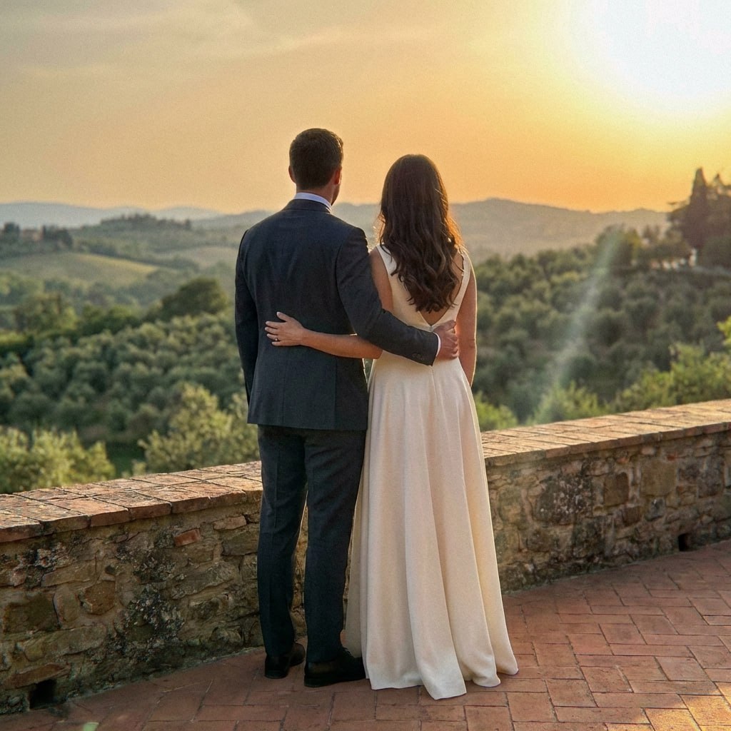
Sage and terracotta glow in golden hour.
Your September palette looks its best in late-afternoon light. Make sure guests capture those moments - QR code at each table, all photos in one album.
From Mom
Scan to join the album
No app, no account
UPLOADING
Saving your moment
THE ALBUM
Emma & Jack
June 21, 2026
647 photos · 95 guests
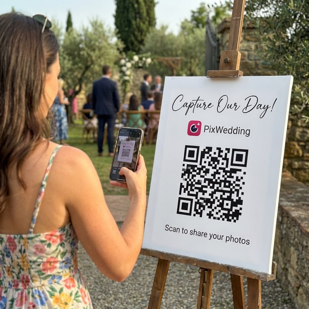
SCAN TO TRY
pix.wedding/
your-wedding
Why September Is the Best Month for Transitional Wedding Palettes
September occupies a unique window in the wedding calendar: summer has not quite let go, but fall is already hinting at its arrival. Average daytime highs in most of the continental US sit between 68 and 80 degrees Fahrenheit in September, meaning outdoor ceremonies remain comfortable while the landscape begins its slow color shift.
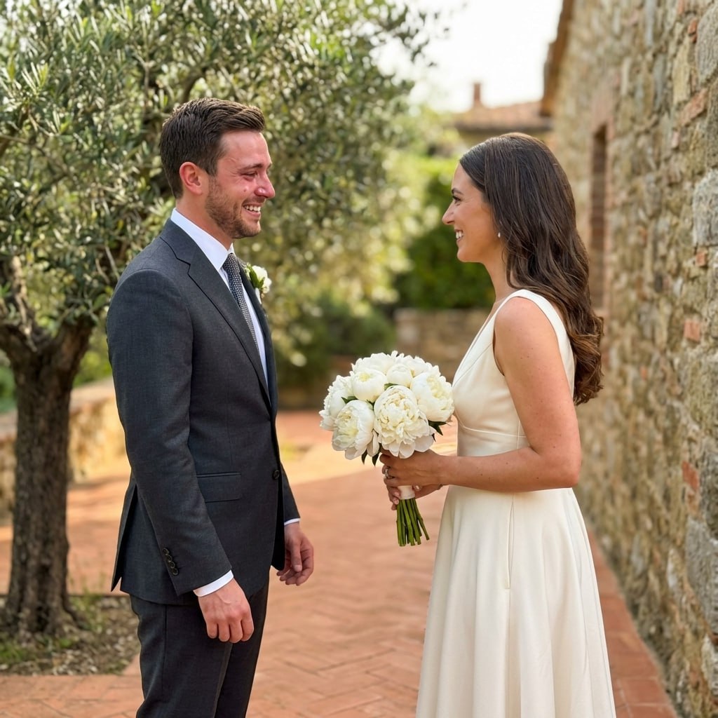
This weather reality should drive your color choices. Heavyweight tones like deep burgundy or moody plum read as premature in early September when guests are still in lightweight linens. Transitional palettes that blend earthy warmth with natural freshness photograph authentically and look seasonally correct.
Late-summer gardens reach their fullest expression in September. Dahlias, sunflowers, and zinnias are in peak bloom, and their natural palette of coral, amber, warm yellow, and dusty rose maps almost perfectly onto the most popular September wedding color families.
- •Sage green: bridges summer freshness with fall earthiness
- •Terracotta: warm clay tones that echo late-summer soil and harvest fields
- •Dusty blue: a cooler accent that keeps palettes from feeling too heavy
- •Peach and apricot: soft, warm tones that flatter every skin tone in September light
- •Antique gold: an evening accent that glows in early golden hour
- •Warm ivory and linen: the neutral anchors every September palette needs
How to Build a September Wedding Color Palette Step by Step
Start with your venue. Outdoor barn or garden venues in September tend to have warm wooden tones and green foliage as their backdrop, which pairs naturally with sage, terracotta, and warm blush. Urban rooftop or modern hotel venues benefit from cooler dusty blue and lavender pairings that contrast cleanly with architectural settings.
Layer three colors: a dominant (60%), a secondary (30%), and an accent (10%). For a classic September palette, dominant dusty sage on bridesmaid dresses, secondary warm ivory on linens and stationery, and terracotta accent in florals and ribbon detail is a formula that works across nearly every venue type.
Tie the palette to your ceremony time. Morning September weddings photograph best with soft, light tones: blush, peach, and lavender. Afternoon ceremonies suit earthy sage and terracotta. Candlelit evening receptions in September can introduce antique gold as a warm accent against dusty blue or sage.
September Wedding Color Palettes by Venue Type
Garden and outdoor vineyard venues: lean into the still-green landscape. Sage and terracotta blend into the natural surroundings rather than fighting them. Add deep peach florals and warm ivory table linens for a cohesive look that feels intentional rather than incidental.
Barn and rustic venues: dusty rose with warm gold accents photographs beautifully against weathered wood. Avoid pure white, which creates too sharp a contrast in candid photography. Warm ivory or linen white is the better neutral choice.
Hotel ballroom and indoor venues: dusty blue and lavender with gold metallic details bring the September color story indoors effectively. The cooler tones look intentional against neutral ballroom walls and avoid the washed-out effect that very warm palettes can create under indoor lighting.
Explore more free wedding tools
Everything you need to make your wedding day stress-free and unforgettable.
QR Sticker Designer
Design custom print-ready stickers.
Hashtag Generator
Create unique wedding hashtags.
How to Collect Guest Photos
5 methods ranked by participation rate and ease.
Get Photos After the Wedding
Message templates to gather guest photos post-wedding.
Share Wedding Photos with Guests
Compare every sharing platform by ease and participation.
Best Way to Get Guest Photos
The single method with the highest participation rate.
How to Make a Shared Wedding Album
Step-by-step setup for every platform.
Alternative to Disposable Cameras
Better, cheaper options than disposable cameras.
September Wedding Colors FAQ
Everything you need to know about our free tools and how they help your wedding day.
September sits at the summer-to-fall crossover, so the best palettes blend warmth and freshness: sage green with terracotta, dusty blue with peach, lavender with antique gold, and warm ivory with rust accents all work beautifully. Avoid heavy winter tones like deep navy or burgundy, which feel more at home in November.
Early September still feels like summer in most of the US, so true fall palettes with dark burnt orange and chocolate can look ahead of the season. Mid-to-late September is the sweet spot where transitional palettes shine: earthy terracottas, muted sages, and dusty warm tones photograph well in the still-bright but golden September light.
September is generous for florals. Dahlias, zinnias, asters, and late-season sunflowers are peak-perfect. Garden roses continue strong, and early chrysanthemums begin to appear. These blooms align perfectly with sage, terracotta, and peach palettes, giving you full color range without premium out-of-season pricing.
Dusty sage, terracotta, warm blush, and dusty blue are the top bridesmaid choices for September. Chiffon and lightweight crepe fabrics are ideal since daytime September temperatures are still warm. Avoid heavy velvet, which belongs more to November and December weddings.
September light is still bright and warm but has shed the harsh midday glare of July and August. Golden hour arrives earlier, giving longer windows for soft, glowing portraits. Sage greens and dusty blues photograph with more luminosity in September sun, while October's overcast days bring out the richness of deeper tones like burnt orange.
Absolutely. September is the best month for mixed-temperature palettes. Dusty blue (cool) paired with peach or terracotta (warm) is a signature September combination. The key is using a neutral anchor: warm ivory, antique white, or greige ties warm and cool elements together without visual tension.