Wedding Color Palette Generator
Find the perfect color scheme for your big day. Select your season and vibe to instantly generate curated palettes, then copy hex codes to share with your vendors.
Email me my color palette
Get your color palette sent straight to your inbox so it doesn't get lost.
No spam. Unsubscribe anytime.
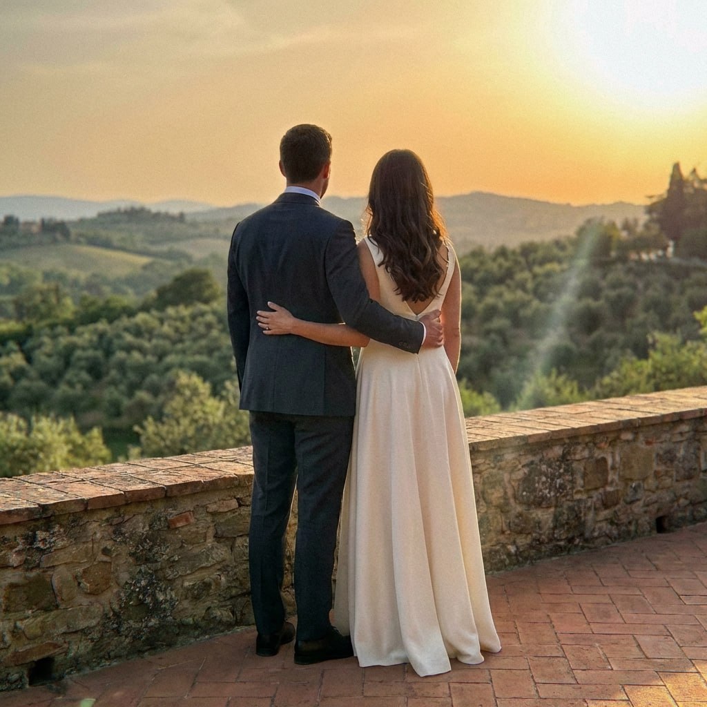
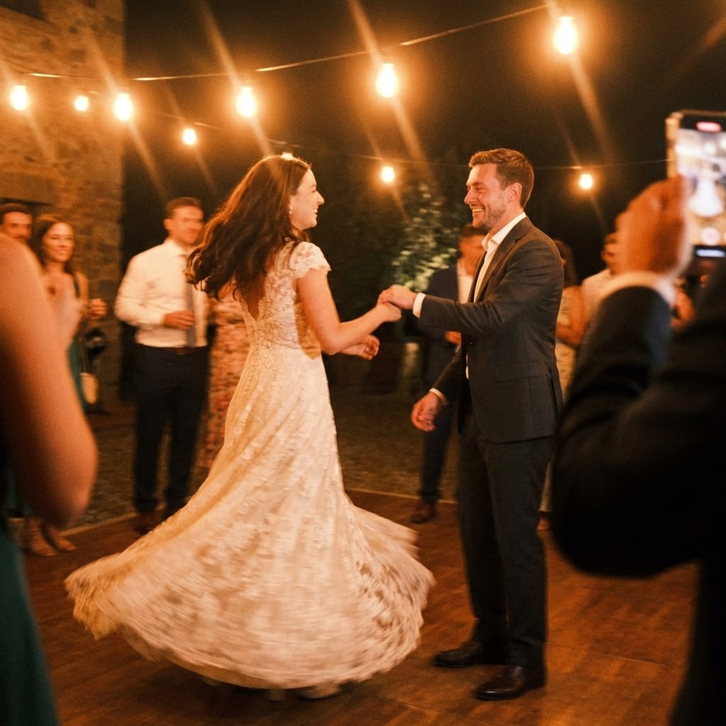
First dance
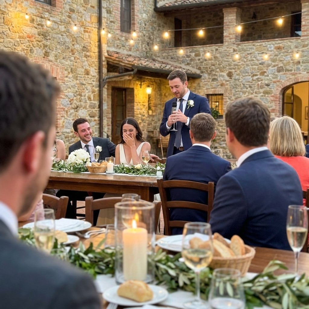
You guys!!
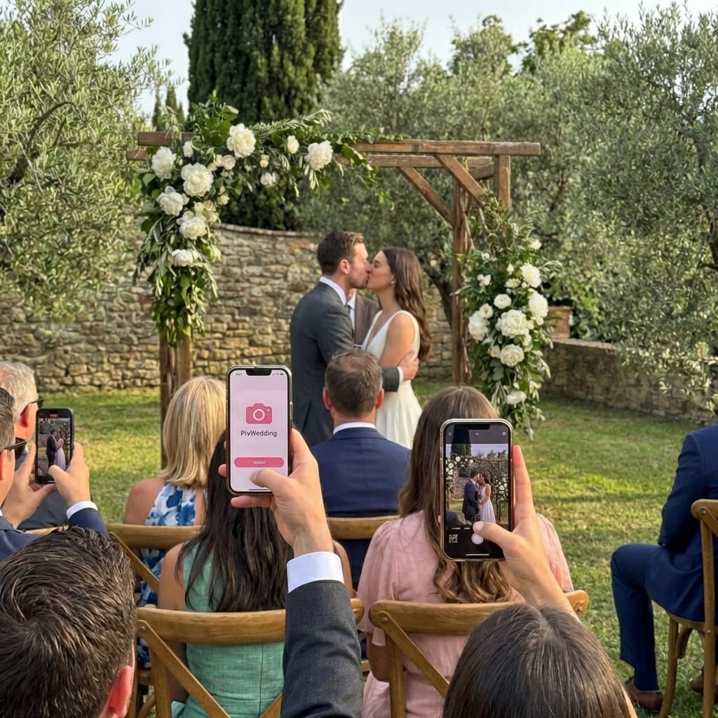
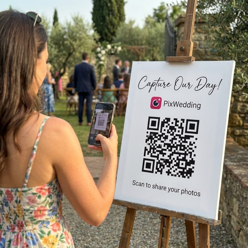
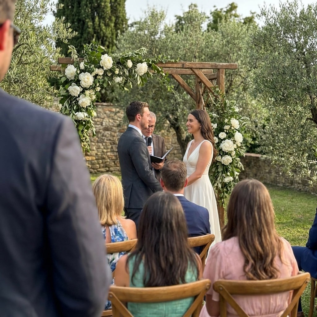
Your palette looks best in real photos.
Mood boards are great for planning, but nothing beats actual photos of your colors in action. Give guests a QR code and collect every table, floral, and detail shot in one place.
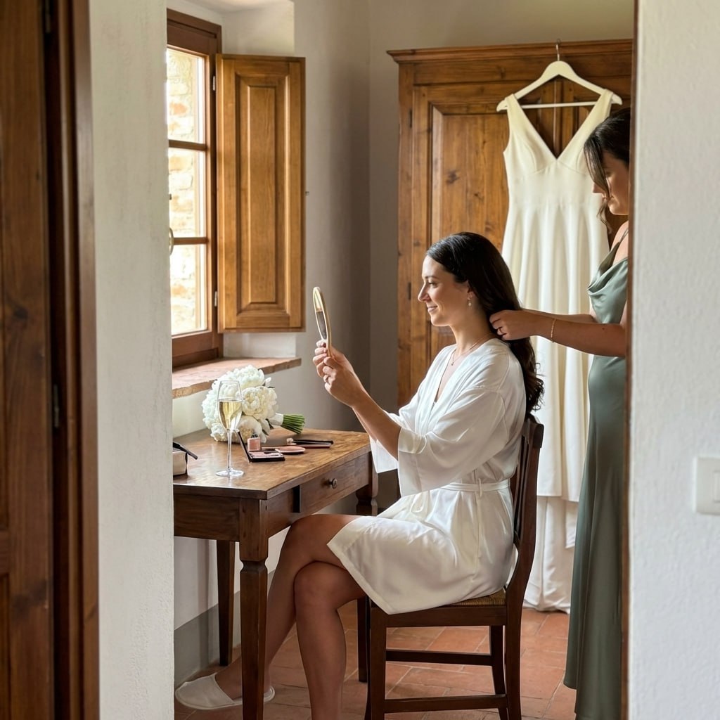
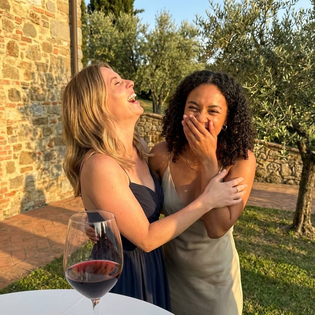
From Mom
Scan to join the album
No app, no account
UPLOADING
Saving your moment
THE ALBUM
Emma & Jack
June 21, 2026
647 photos · 95 guests
SCAN TO TRY
pix.wedding/
your-wedding
Why Use Our Color Palette Generator?
The fastest way to find, preview, and share your wedding colors with everyone on your vendor team.
Curated Palettes
20 hand-picked palettes across seasons and styles, designed by color experts for real weddings.
Instant Preview
See your colors side by side in a beautiful display. Hover over any swatch to reveal the exact hex code.
Copy Hex Codes
Click any color to copy its hex code. Share exact shades with your florist, baker, and stationer.
How to Choose Your Wedding Color Palette
Your wedding color palette sets the visual tone for the entire celebration. From invitations and flowers to bridesmaid dresses and table settings, the colors you pick will tie every detail together into a cohesive look.
The best approach is to start with what inspires you and then narrow your choices based on practical considerations like season, venue style, and your personal wardrobe preferences.
- •Consider your wedding season: nature provides a built-in backdrop that your colors should complement, not clash with.
- •Think about your venue: a rustic barn calls for different tones than a sleek city loft or a beachfront terrace.
- •Reflect on personal style: look at your closet and your home decor for colors you are naturally drawn to.
- •Factor in skin tones: choose shades that flatter you and your wedding party in photos.
- •Use the rule of three: pick one dominant color, one supporting color, and one neutral accent to keep the palette balanced.
- •Test with fabric swatches: digital screens can shift colors, so always confirm your choices with physical samples before ordering.
Wedding Color Trends by Season
Each season brings its own mood and natural lighting, which directly affects how your wedding colors will look in photos and in person. Aligning your palette with the time of year creates a seamless, polished aesthetic.
That said, rules are made to be broken. A deep jewel-tone palette can look stunning at a summer evening reception, and soft pastels can bring unexpected warmth to a winter ceremony.
- •Spring: soft pastels like blush pink, lavender, sage green, and buttercream yellow pair beautifully with blooming gardens.
- •Summer: bold and tropical shades such as coral, ocean blue, sunny yellow, and bright fuchsia match the energy of long, warm days.
- •Fall: warm, earthy tones including burnt orange, burgundy, terracotta, mustard, and deep olive capture the richness of autumn.
- •Winter: deep jewel tones like emerald, navy, ruby, and plum create drama, while icy silver and white add elegance to cold-weather celebrations.
How to Use Your Wedding Colors Across Every Detail
Once you have settled on a palette, the next step is weaving those colors consistently through every element of your day. Consistency is what separates a Pinterest-worthy wedding from one that feels a bit scattered.
You do not need to use every color in every detail. Instead, choose two or three touchpoints for each shade so the palette feels intentional without being overwhelming.
- •Bridesmaids dresses: the most visible use of your palette. Consider mixing shades within the same color family for a modern look.
- •Flowers and bouquets: your florist can match blooms to your hex codes for a precise color story.
- •Table settings and linens: napkins, runners, and charger plates are easy ways to layer your colors into the reception.
- •Invitations and stationery: set the tone before the event by featuring your palette on save-the-dates, invitations, and programs.
- •Cake and desserts: colored frosting, macarons, or fresh flowers on the cake tie the sweetest part of the day to your palette.
- •Lighting and decor: uplighting in your accent color can transform an entire venue and makes for incredible photos.
Explore more free wedding tools
Everything you need to make your wedding day stress-free and unforgettable.
QR Sticker Designer
Design custom print-ready stickers.
Photo Sharing QR
The best way to collect guest photos.
Hashtag Generator
Create unique wedding hashtags.
How to Collect Guest Photos
5 methods ranked by participation rate and ease.
Get Photos After the Wedding
Message templates to gather guest photos post-wedding.
Share Wedding Photos with Guests
Compare every sharing platform by ease and participation.
Best Way to Get Guest Photos
The single method with the highest participation rate.
How to Make a Shared Wedding Album
Step-by-step setup for every platform.
Wedding Color Palette FAQ
Everything you need to know about our free tools and how they help your wedding day.
Most designers recommend 3 to 5 colors. A strong palette typically includes one dominant color, one or two supporting shades, and a neutral accent. Our generator gives you five colors per palette so you have plenty to work with while keeping everything cohesive.
Not at all. Seasonal palettes look naturally cohesive because they complement the surrounding environment, but there are no strict rules. A moody burgundy-and-navy palette can be stunning in spring, and soft pastels can feel fresh and unexpected in winter.
The most reliable method is sharing hex codes. Click any color swatch in our generator to copy its hex code to your clipboard, then paste it into emails, mood boards, or shared documents. Hex codes remove all guesswork and ensure your florist, baker, and printer are working with the exact same shade.
Blush pink, dusty blue, sage green, and classic ivory remain perennial favorites. In recent years, terracotta, burgundy, and dusty rose have surged in popularity, along with bolder choices like emerald green and rich navy for couples who want a more dramatic look.
Absolutely. Metallics like gold, rose gold, and silver work as elegant neutral accents in almost any palette. Gold pairs beautifully with warm tones like blush and burgundy, while silver complements cooler shades like dusty blue and lavender.
They do not have to be an exact match. Many couples choose dresses in the same color family but allow slight variations in shade or fabric, which creates a more natural, layered look. Mismatched bridesmaids in coordinating tones is one of the most popular trends right now.
Test your palette in different lighting conditions, both natural daylight and indoor artificial light. Avoid neon or overly saturated shades that can look harsh on camera. Muted, earthy tones and classic jewel tones tend to photograph beautifully in almost any setting.
It depends on how far along you are. Florists and stationers are usually flexible early in the process, but fabric orders and custom prints may be harder to change once production has started. Communicate any palette shifts to your vendors as soon as possible to avoid extra costs or delays.