Fall Wedding Color Palettes 2026: 30 Curated Schemes with Hex Codes
Not just a color list: a complete framework for building your fall wedding palette from primary to accent, matched to your venue type and color theory principles.
Share Your Wedding Photos FreeHow to Build a Fall Wedding Palette: The Framework
Every palette has four roles: primary, secondary, accent, and neutral. Understanding these roles prevents the common mistake of choosing colors you love individually that fight each other when combined.
Primary (60%)
Your dominant color. It appears on bridesmaid dresses, tablecloths, ceremony backdrop, and most florals. Choose your favorite fall shade here: burgundy, terracotta, or sage are the most popular for 2026.
Secondary (30%)
Supports and complements the primary. Should either be analogous (nearby on the color wheel) for harmony, or complementary (across the wheel) for visual tension. Examples: burgundy primary with sage secondary (complement) or rust primary with terracotta secondary (analogous).
Accent (10%)
The small details that elevate the palette: ribbon, candle holders, place cards, cake decoration. For fall, gold, copper, and antique brass are the most popular metallic accents. A non-metallic option: dusty mauve or blush.
Neutral (varies)
The breathing room in your palette. Cream, ivory, warm white, or linen. Neutrals appear on stationery backgrounds, table runners, and venue walls. They prevent the palette from feeling saturated and overwhelming.
Balancing Warm and Cool in Fall Palettes
Pure warm palettes (all orange, rust, and gold) can feel heavy. Pure cool palettes (all sage, dusty blue, and grey) can feel disconnected from the autumn season. The most sophisticated fall palettes balance both.
Warm Primary, Cool Accent
Rust (#C1440E) + Sage (#8FAF88) + Gold (#DAA520)The cool sage accent keeps the warm rust from feeling too heavy. Gold bridges both sides. This is the most popular combination for fall 2026.
Cool Primary, Warm Accent
Dusty Blue (#5C7A9E) + Rust (#C1440E) + Cream (#FAF0DC)Unexpected and striking. Cool blue primary is unusual for fall but creates visual contrast against autumn foliage. The rust accent anchors it to the season.
Equal Warm and Cool
Burgundy (#722F37) + Sage (#8FAF88) + Gold (#DAA520)Burgundy reads as both warm and cool depending on context. Sage green complements it perfectly. This is the definitive vineyard fall palette.
Neutral Bridge
Cream (#FFF8F0) + Terracotta (#C1440E) + Stone (#8B8076)Cream and stone neutrals bridge warm and cool without directly mixing hue temperatures. This creates a sophisticated, restrained palette that photographs beautifully.
Barn and Farm Fall Wedding Palettes
Barn venues have natural textures (wood, hay, exposed beams) that work best with warm earthy palettes. These eight palettes are designed for the barn aesthetic, from classic harvest hues to unexpected dusty-blue-and-rust combinations.
Harvest Barn
This is the definitive barn palette. Rust primary with terracotta secondary and straw-gold accents echo the barn wood, hay bales, and dried floral arrangements naturally.
Sunflower Farmhouse
Goldenrod primary drives the warm energy. Saddle brown grounds it. Sandy peach accents soften the combination. Classic farmhouse feeling without being cliche.
Cider House
Sienna primary reads as sophisticated while still feeling rustic. Burnt orange creates warmth. Gold accents elevate the palette from casual to refined.
Tobacco Road
For couples wanting a barn palette without orange. Deep walnut and pecan tones with caramel accents feel warmly organic and deeply photogenic.
Prairie Sky
An unexpected barn palette. Dusty blue primary contrasts with rust secondary for visual tension that photographs dynamically against weathered wood.
Sagebrush
Sage green primary brings softness to a rustic barn setting. Walnut secondary grounds it. Antique gold accents add a touch of elegance to the natural earthy base.
Apple Orchard
Inspired by actual apple orchards. Deep red primary with rust secondary and sunflower accents creates a joyful, harvest-season narrative.
Burlap and Blush
The softer barn palette option. Dusty rose primary with burlap-tan secondary gives a feminine rustic look that pairs with lace tablecloths and mason jar florals.
Vineyard Fall Wedding Palettes
Vineyard weddings call for palettes that mirror the harvest: burgundy, deep green, warm amber, and stone. These seven palettes are calibrated to complement grape vines, stone walls, and the rolling hills of wine country.
Harvest Grape
The natural palette of a vineyard at harvest. Deep burgundy and wine tones with gold accents mirror the grape clusters themselves.
Vineyard Sage
The leaves of the vine are as important as the grapes. Green primary with merlot secondary creates an authentic vineyard color story.
Tuscan Sun
Warm amber primary evokes Tuscan architecture. Terracotta secondary is classic Mediterranean. Wine accents complete the Italian vineyard fantasy.
Stone Wall
For wineries with stone architecture. A sophisticated neutral primary with slate secondary and gold accents. Timeless and editorial.
Late Harvest Rosé
Inspired by rosé wine itself. Pale pink primary anchored by deep burgundy secondary. This palette appeals to couples wanting romantic vibes in a winery setting.
Cabernet
The darkest and most dramatic vineyard palette. Near-black cabernet primary layered into burgundy secondary with warm cognac accents.
Autumn Vineyard
Peak fall at the vineyard: orange leaves, burgundy grapes, green vines. Three primary fall colors assembled into one cohesive wedding palette.
Ballroom Fall Wedding Palettes
Hotel ballrooms and event spaces allow dramatic dark and jewel-tone palettes that would look out of place outdoors. These seven palettes maximize chandelier light and black-tie formality.
Midnight Glamour
The ultimate ballroom palette. Midnight primary with burgundy secondary and gold accents creates pure glamour. Black-tie elegance for evening receptions.
Amethyst Gala
Amethyst purple primary creates a regal statement. Deep plum secondary adds depth. Gold accents reflect chandelier light beautifully.
Copper and Slate
Cool slate primary contrasted with warm copper secondary creates sophisticated visual tension. Ideal for modern hotel ballrooms.
Emerald Gala
Deep emerald primary feels lush and opulent. Espresso secondary provides grounding. Gold accents make everything sparkle under ballroom chandeliers.
Crimson and Ivory
A classic holiday-adjacent ballroom palette. Deep crimson primary against ivory secondary creates striking visual contrast. Gold accents add warmth.
Rose Gold Glam
Rose gold primary bridges warm and cool. Bronze secondary adds depth. Gold accents create an all-metallic shimmer effect that dazzles under ballroom lighting.
Sapphire Night
Deep royal blue primary with navy secondary. Gold accents are essential to prevent this from reading too corporate. An aristocratic, timeless ballroom statement.
Garden Fall Wedding Palettes
Botanical gardens, estate gardens, and outdoor garden venues suit softer, more botanical palettes. These five palettes work with the natural surroundings rather than competing with them.
English Garden
The quintessential English garden palette. Sage green primary with blush secondary feels romantically botanical. Ideal for outdoor garden ceremonies.
Late Bloom
Dusty rose primary feels like the last roses of the season. Sage secondary balances the warmth. Amber accents capture the slant of fall afternoon light.
Wildflower Meadow
A more whimsical garden palette. Unexpected lavender primary with peach secondary and golden accents. Feels free-spirited and joyful.
Frost Garden
For a late-fall garden wedding. Frosty blue primary with warm blush secondary and gold accents creates a cool-warm balance that suits November outdoor ceremonies.
Garden Party
A fresh, playful garden palette. Forest green primary with light pink secondary and gold accents. Coordinates beautifully with seasonal flowers.
Which Palette Category Is Right for You?
If your venue has exposed wood, hay bales, or a farm setting
Choose a Barn palette. Warm earthy tones complement the natural textures without competing with them.
If your venue has grape vines, stone walls, or rolling vineyard hills
Choose a Vineyard palette. Burgundy, green, and amber tones mirror the landscape and feel authentically seasonal.
If your reception is indoors under chandeliers with a formal dress code
Choose a Ballroom palette. Dark jewel tones and metallic accents amplify under artificial lighting for maximum glamour.
If your ceremony is in a botanical or estate garden
Choose a Garden palette. Sage, blush, and cream tones complement plants and natural surroundings without overwhelming them.
If none of these fit
Use the color theory framework: choose a primary you love, apply the 60-30-10 rule, and find the complementary or analogous secondary from the color wheel.
Choosing the Right Metal Accent for Your Fall Palette
Metal accents (gold, copper, silver, rose gold, bronze) function as a fifth dimension of your palette. They appear on candlestick holders, chargers, frames, stationery foil, jewelry, and hardware details. Getting the metal right ties everything together; getting it wrong creates visual dissonance.
Antique Gold
#D4AF37Best with: Warm, Vineyard, Ballroom
The most universal fall accent. Warm-toned and slightly muted, antique gold complements everything from rust and terracotta to burgundy and emerald. Avoid bright polished gold, which reads as modern and can clash with organic fall textures.
Copper
#AD6F3BBest with: Warm, Barn, Rustic
The rustic metal choice. Copper adds warmth and organic texture that pairs beautifully with burlap, wood, and mason jars. Hammered copper vessels are particularly effective. Best with warm earthy palettes rather than cool jewel tones.
Brushed Bronze
#8B6914Best with: Warm, Neutral, Garden
Warmer and more muted than gold. Bronze reads as vintage and refined without the brightness of polished gold. An excellent choice for couples who want metallic accents that feel aged and architectural.
Silver
#C0C0C0Best with: Neutral, Moody, Ballroom
The cool metal choice. Silver works best with cool-dominant palettes: slate and navy, grey and ivory, moody palettes with dusty blue accents. Avoid silver with warm palettes like rust and terracotta, where it can feel discordant.
Rose Gold
#C78A7ABest with: Dusty Rose, Blush, Neutral
The warmest metal, with a distinct pink-red tone. Rose gold bridges the gap between warm metals and blush pinks, making it ideal for dusty rose and neutral palettes. Particularly popular for jewelry and stationery foil.
Applying Your Fall Palette Across the Full Wedding Suite
A palette does not live only in flowers and dresses. It must be applied consistently across stationery, cake, signage, venue decor, and attire accessories. Here is the element-by-element breakdown of how to apply a fall palette across your full wedding suite.
Save the Dates
First impression. Set the color expectation here. Use your primary color as the type or border color, your neutral as the cardstock background, and your metal accent as a foil detail.
Invitations
The fullest expression of your palette in print. Use all 4-5 palette colors thoughtfully: primary type, secondary envelope, accent foil, neutral insert card, metal wax seal.
Ceremony Programs
Seen in natural light. Keep simpler than invitations. Primary color type on neutral cardstock with a small accent element like ribbon or a dried flower.
Reception Signage
Viewed at distance. Use high-contrast combinations: dark primary type on neutral background or neutral type on dark primary background. Large format requires high contrast.
Table Numbers
Small format. Metal frames in your accent metal with simple cards. Or palette-colored cards with contrasting type.
Menus
Seen up close during the meal. Can be more detailed than signage. Primary color header with neutral body type. Accent border or dried botanical element.
Cake Design
Confirm cake colors with physical swatches, not digital only. Fondant absorbs color differently than buttercream. Request a test batch in your primary palette color.
Bridesmaid Attire
The largest moving color surface at your wedding. Typically your secondary or primary color. The most visible palette element in ceremony photographs.
Centerpieces
The most complex palette expression. Use your primary color as the dominant floral, secondary as supporting florals, accent as decorative details (ribbon, candles, vessels), and neutral as greenery filler.
Fall Wedding Palette Finalization Checklist
Before locking in your fall palette and sharing it with vendors, work through this checklist to avoid the most common palette pitfalls.
Choosing Phase
Testing Phase
Sharing Phase
Watch: applying the 60/30/10 rule to your wedding colors
"How to Choose Your Wedding Colors | The 60/30/10 Rule for a Stunning Design" by Howerton+Wooten Events walks through the same dominant/secondary/accent framework used throughout this guide, with real wedding photos showing the ratio in practice.
Pro Tip: Always Share Hex Codes, Not Color Names
Color names are subjective. One florist's "dusty rose" is another's "blush." One stationer's "sage" is another's "olive." The only way to ensure consistency across every vendor is to use hex codes (e.g., #8FAF88 for sage) or Pantone color references. Create a one-page palette document that includes your hex codes, a printed color swatch, and the name you use for each color. Share this document with every vendor at the start of the engagement. It takes 20 minutes to create and prevents countless costly miscommunications.
#8FAF88#C49080#722F37#D4AF37#FAF0E6Sources: The Knot, 2026 wedding color trend coverage, Poppy Flowers seasonal availability guide.
Explore More Fall Wedding Color Resources
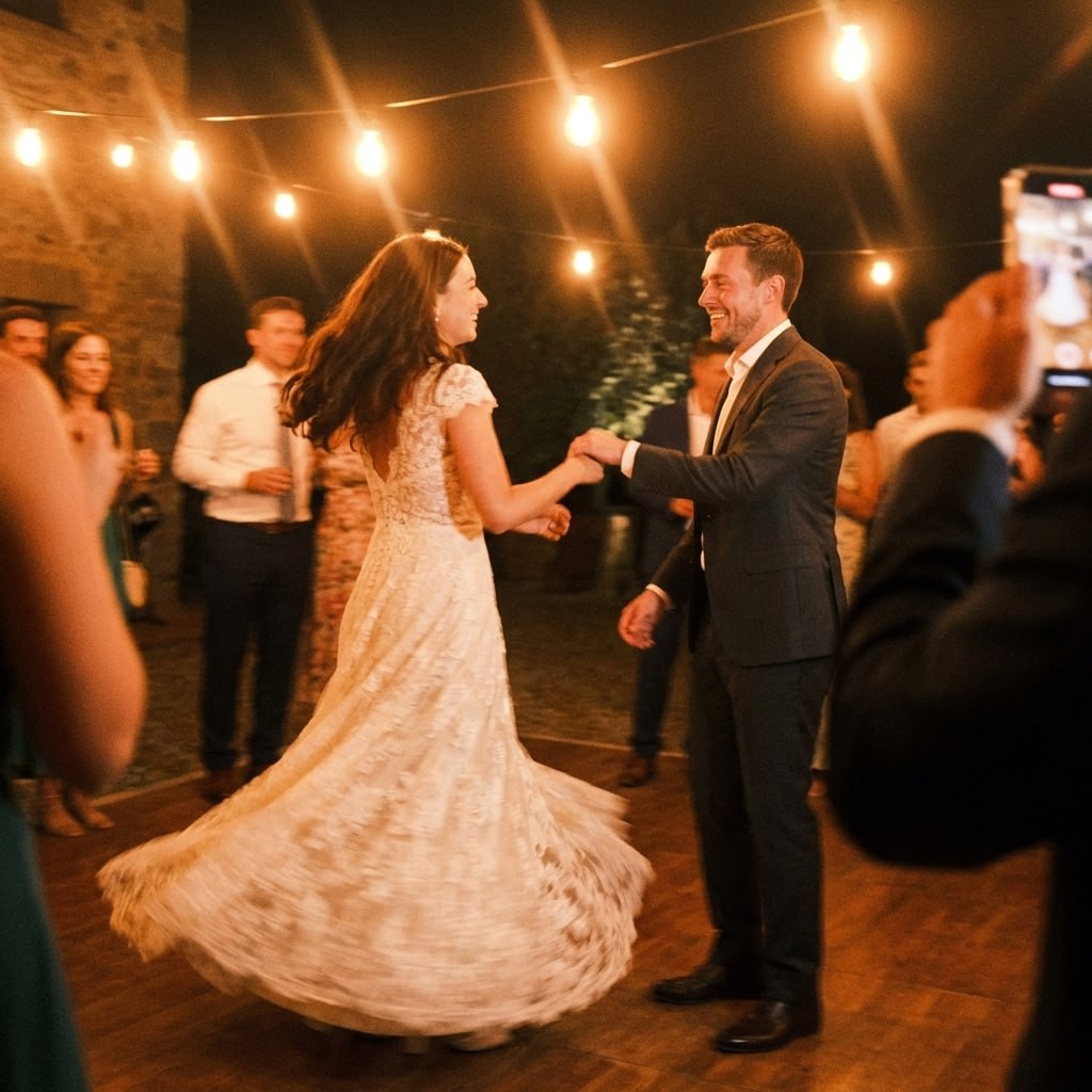
First dance
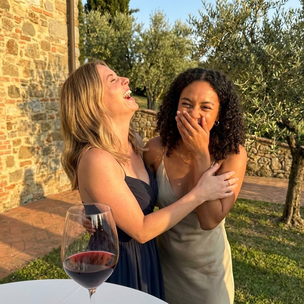
You guys!!
Those colors look even better in photos.
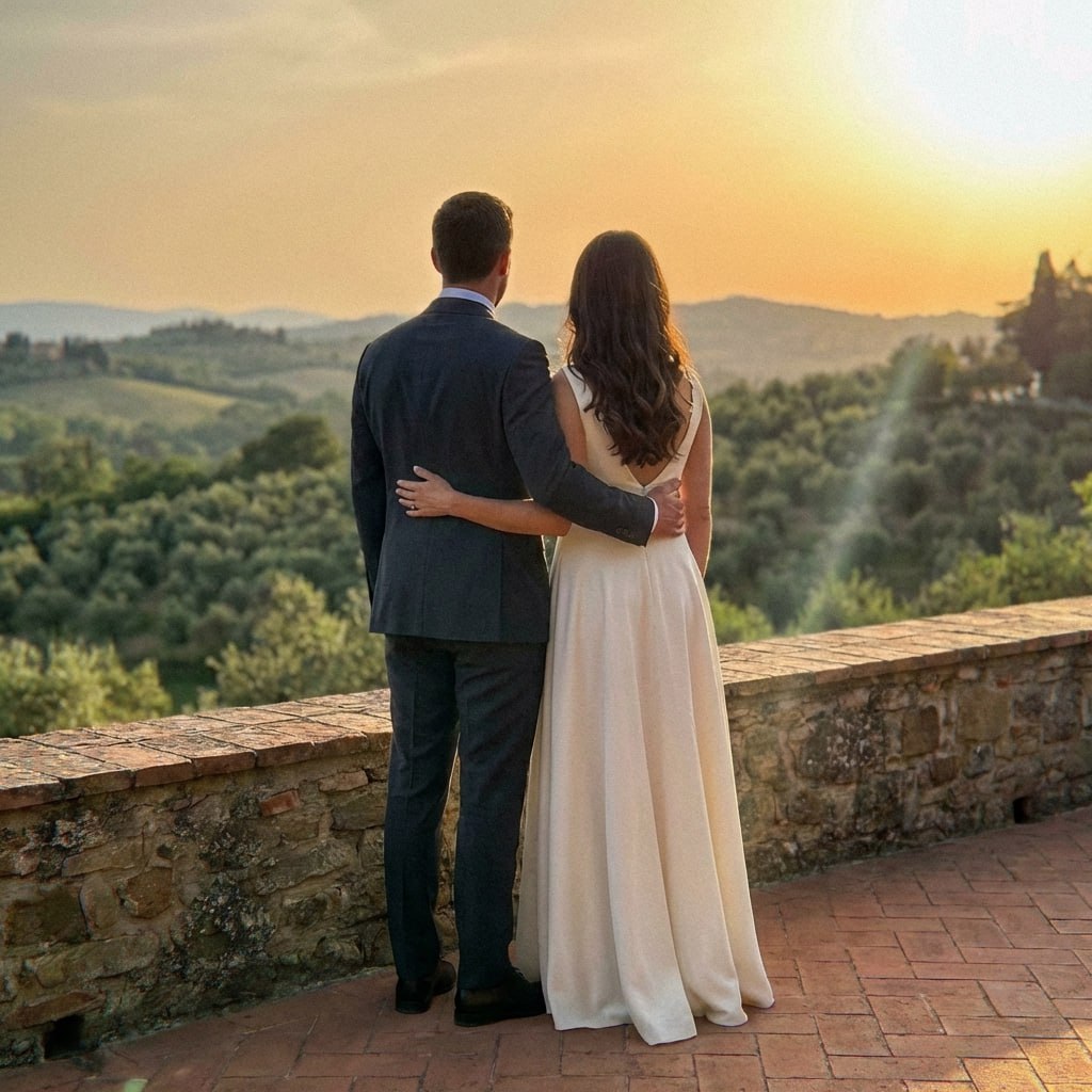
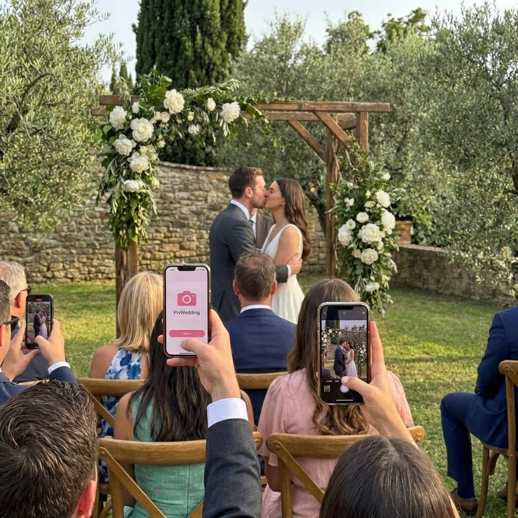
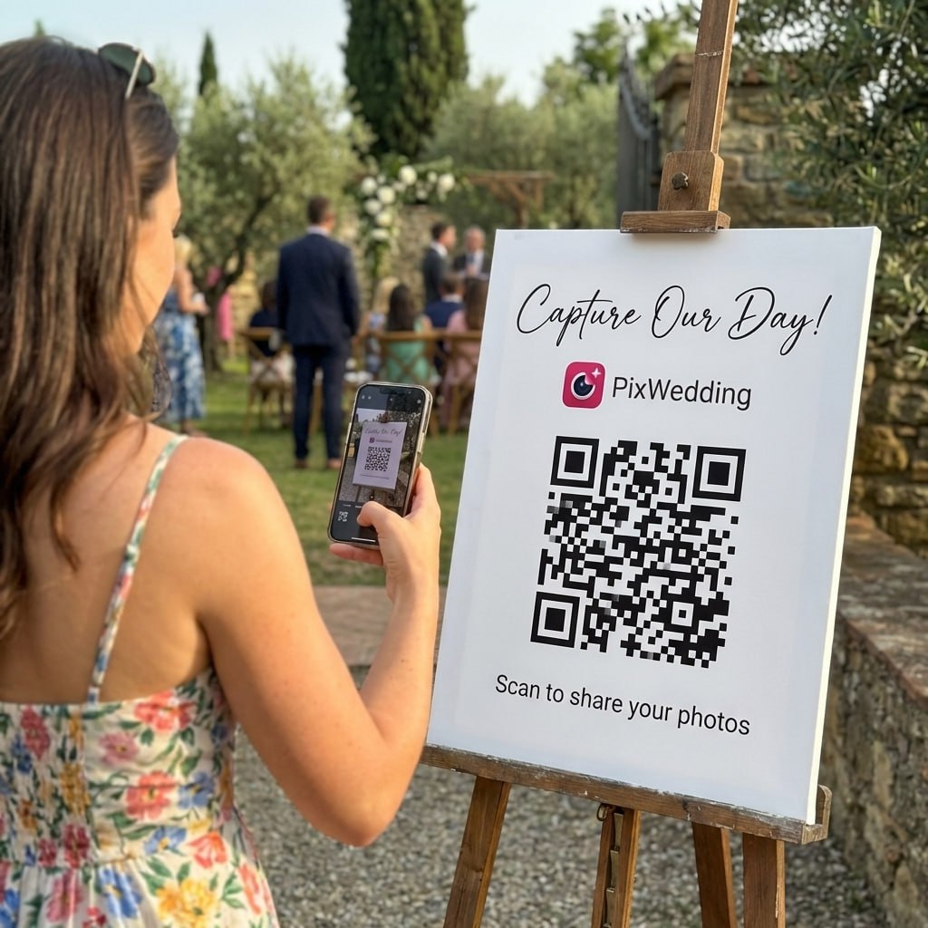
Your palette took weeks to perfect. Make sure guests actually photograph the tablescapes, florals, and details - all in one shared album.
From Mom
Scan to join the album
No app, no account
UPLOADING
Saving your moment
THE ALBUM
Emma & Jack
June 21, 2026
647 photos · 95 guests
SCAN TO TRY
pix.wedding/
your-wedding
The Science of Building a Fall Wedding Color Palette
Color theory gives every great wedding palette its backbone. The three most useful color relationships for fall weddings are analogous (colors adjacent on the color wheel, like orange, red-orange, and red), complementary (colors opposite each other, like rust and dusty blue), and split-complementary (one color plus the two colors adjacent to its complement, offering visual richness with less tension).
For fall weddings, analogous palettes feel cohesive and seasonal: terracotta, rust, and pumpkin orange all sit in the same warm orange-red neighborhood. Complementary palettes create visual tension and dynamism: deep burgundy with sage green creates a balance that is neither too warm nor too cool. Split-complementary palettes offer complexity: burgundy as primary, with sage green and dusty blue as the split complements.
The 60-30-10 rule is your practical guide. Your dominant color (60%) should appear on the largest surfaces: tablecloths, bridesmaid dresses, and floral arrangements. Your secondary color (30%) appears on medium elements: invitation envelopes, centerpiece accents, ceremony backdrop. Your accent color (10%) appears on small details: place cards, ribbon, candle holders, cake decorations.
- •Analogous: colors adjacent on the wheel; feel cohesive and harmonious
- •Complementary: opposite colors; create visual tension and drama
- •Split-complementary: one primary plus two adjacent-to-complement colors; rich without chaos
- •60-30-10 rule: dominant, secondary, and accent color ratios
- •Always add at least one neutral to prevent the palette from feeling overwhelming
How Venue Lighting Changes Your Fall Color Palette
The same color can look completely different depending on venue lighting. Warm incandescent or candlelight amplifies warm tones (orange, rust, gold) and mutes cool tones (blue, green, lavender). If your reception uses warm lighting, your sage green bridesmaid gowns may appear more olive-yellow than green in photographs.
Cool LED lighting, common in modern hotels and convention ballrooms, tends to be more neutral but can make warm colors appear slightly less saturated. Outdoor natural light in fall is warm and golden, especially in the afternoon golden hour, which is why most wedding photographers schedule outdoor portraits 1-2 hours before sunset.
To test your palette under your actual venue lighting, bring fabric swatches and floral samples to your venue walkthrough. Look at them under the specific lighting conditions of your ceremony and reception spaces at the same time of day as your wedding. Colors that look perfect in a florist shop can shift significantly under string lights or church candles.
Seasonal Availability and Your Fall Palette
A beautiful color palette is only achievable if the flowers you need are actually in season. Dahlias run July through mid-October and peak in August and September, but they are frost-sensitive, so a single night below freezing ends the season early, which matters for a late-November wedding date. Chrysanthemums are hardier and tolerate light frost, making them a more dependable choice than dahlias if your date falls in mid-to-late November, according to seasonal flower guides from wholesale florists.
Marigolds add affordable orange and gold tones, calla lilies come in many deep fall shades, and amaranth contributes deep red and burgundy. Roses and ranunculus are grown commercially year-round, so any rose color in your palette is achievable regardless of season. Peonies are a spring flower and will be expensive or unavailable in fall. Eucalyptus and other greenery are available year-round and add texture to any palette.
What Is Actually Trending for Fall 2026
Wedding trend coverage for the 2026 season points to a shift away from the classic burnt-orange-and-burgundy combination toward layered, muted earth tones with an interior-design influence. The Knot's 2026 color trend roundup and other industry coverage highlight deep plum, terracotta, sage, forest green, and champagne as the standout directions for fall.
The structural trend matters as much as the specific hues: instead of stretching a palette across five or six colors, planners are favoring two or three complementary tones in different textures and finishes, anchored by one warm neutral. If you are choosing between the 30 palettes above, leaning toward fewer colors with more tonal variation (a matte terracotta next to a glossy rust, for example) reads as more current than an even five-color spread.
Explore more free wedding tools
Everything you need to make your wedding day stress-free and unforgettable.
QR Sticker Designer
Design custom print-ready stickers.
Hashtag Generator
Create unique wedding hashtags.
How to Collect Guest Photos
5 methods ranked by participation rate and ease.
Get Photos After the Wedding
Message templates to gather guest photos post-wedding.
Share Wedding Photos with Guests
Compare every sharing platform by ease and participation.
Best Way to Get Guest Photos
The single method with the highest participation rate.
How to Make a Shared Wedding Album
Step-by-step setup for every platform.
Alternative to Disposable Cameras
Better, cheaper options than disposable cameras.
Fall Wedding Color Palette FAQ
Everything you need to know about our free tools and how they help your wedding day.
A color palette is the full set of colors used across your entire wedding (attire, flowers, stationery, decor, cake). A color scheme describes the relationship between colors, such as complementary, analogous, or triadic. Most couples build a palette of 3-5 colors, then organize them into primary, secondary, accent, and neutral roles using color scheme principles.
The 60-30-10 rule works well for fall palettes. Use one color for 60% of your decor (dominant), a complementary or analogous color for 30% (secondary), and an accent for 10%. To balance warm and cool, try a warm primary with a cool accent, such as rust orange primary with dusty blue accent, or a cool primary with warm accents like sage green with gold.
Venue architecture, lighting, and natural surroundings all influence how colors read. Barn venues suit warm earthy tones that complement wood and hay. Vineyard ceremonies naturally call for burgundy and green tones that mirror the landscape. Ballrooms handle dramatic jewel tones and dark moody palettes because the controlled lighting amplifies rich colors. Garden venues suit softer botanical palettes with sage, blush, and cream.
Not necessarily. You can either harmonize with the foliage (using warm tones that blend with the landscape) or contrast with it (using cool jewel tones or neutrals that stand out against orange and red leaves). Both approaches produce stunning photographs. Contrasting palettes are often more dynamic in photography, while harmonizing palettes feel more immersive and cohesive in person.
Ideally at least 12 months before your wedding date. Your color palette affects vendor decisions across florals, stationery, catering linens, cake design, attire, and decor rentals. Many of these vendors have limited availability or long lead times for custom color matching. Finalizing your palette early gives you the most flexibility and the best options.
Technically yes, but it becomes much harder to maintain visual cohesion. Most professional wedding designers cap palettes at 4-5 colors, with one being a neutral. If you want more complexity, use a monochromatic approach, such as several shades of burgundy from wine to blush, which creates richness without the chaos of multiple hue families competing for attention.