Fall Wedding Colors 2026: 45 Palettes, Hex Codes and Real Examples
From warm harvest ember to moody midnight burgundy, every fall wedding color palette you need with exact hex codes, flower pairings, and bridesmaid dress ideas.
Share Your Wedding Photos FreeWarm Fall Wedding Colors
Burnt orange, terracotta, pumpkin, amber, and rust: these are the colors that define the classic autumn wedding. They pair with natural wood textures, copper metals, and harvest florals for a cozy, celebratory atmosphere.
Harvest Ember
Rust, burnt orange, golden yellow, and chocolate brown. Perfect for outdoor October ceremonies.
Maple Sugar
Cinnamon, terracotta, sandy beige, and cream. A cozy palette that suits barn and farm venues.
Pumpkin Spice
Deep pumpkin, spiced peach, warm gold, and saddle brown. The quintessential fall statement.
Autumn Bonfire
Firebrick red, flame orange, bright gold, and near-black espresso. Dramatic and rich.
Golden Orchard
Amber, bronze, sienna, and warm ivory. Beautiful against vineyard backdrops.
Copper Kettle
Copper tones layered from dark to light with a cream finish. Metallic and warm.
Autumn Harvest
Burnt sienna, tangerine, sunflower yellow, and walnut. Lively and celebratory.
Caramel Apple
Deep apple red, crimson, caramel, and light peach. Great for September weddings.
Pecan Pie
Walnut, pecan, toffee, and cream. Understated warmth that photographs beautifully.
Amber Dusk
Dark goldenrod, goldenrod, peru, and lemon chiffon. Glowing and luminous.
October Flame
The colors of peak autumn foliage: chocolate, burnt orange, dark orange, and saddle brown.
Mulled Wine Warm
Burgundy anchored by warm sienna, copper, and wheat. Elegant and grounded.
Neutral Fall Wedding Colors
Neutral fall palettes, from stone and taupe to cream and sage, offer timeless elegance that never dates. These palettes photograph beautifully in all lighting and work with virtually any floral style or venue type.
Linen and Fog
Stone, taupe, driftwood, and ivory. Minimalist and photography-friendly.
Cream and Sage
Creamy ivory with muted sage tones. Soft, romantic, and versatile for any venue.
Dusty Blush Neutral
Blush tones that work beautifully in fall light without competing with foliage.
Mushroom and Pearl
Warm mushroom tones with pearl highlights. Sophisticated and timeless.
Driftwood
Natural, bleached-wood tones that feel grounded and organic.
Champagne Toast
Champagne, wheat, and muted gold. Pairs with candlelight for magical receptions.
Graphite and Ivory
A cooler neutral anchor for fall. Modern and editorial in style.
Birch Forest
Light birch bark tones layered from cream to tan to bark brown.
Dusty Mauve
Faded rose and mauve tones that bridge warm and cool. Universally flattering.
Stone and Wheat
Quarry-inspired neutral palette. Feels architectural and composed.
Jewel-Tone Fall Wedding Colors
Jewel tones bring richness and visual drama to fall weddings. Emerald, sapphire, amethyst, garnet, and teal all feel luxurious against autumn foliage and candlelight, and they photograph with extraordinary depth and saturation.
Emerald Twilight
Deep emerald, sapphire, amethyst, and gold. A regal October evening palette.
Sapphire and Copper
Navy sapphire with warm copper and gold accents. Bold and sophisticated.
Plum and Gold
Deep plum, lavender purple, antique gold, and soft blush. Glamorous fall luxury.
Amethyst Forest
Amethyst purple paired with forest green and golden accents.
Teal and Burgundy
Deep teal and rich burgundy with gold highlights. Unexpected and striking.
Garnet and Navy
Garnet red and midnight navy with gold and cream. Classic jewel-tone luxury.
Ruby and Jade
Deep ruby, lush jade green, and antique gold. Vibrant and memorable.
Midnight Berry
Deep midnight purple with berry tones and warm brown undertones.
Cobalt and Rust
Cobalt blue contrasted with rust orange and amber. High-energy and modern.
Forest and Merlot
Rich forest green and merlot red with gold. Perfect for November ceremonies.
Moody Fall Wedding Colors
Moody fall palettes lean into darkness and depth: midnight burgundy, smoked plum, black forest green, obsidian, and velvet fig. These palettes suit evening receptions illuminated by candlelight and are increasingly popular for couples who want a dramatic, editorial aesthetic.
Midnight Burgundy
Almost-black wine tones layered with dark crimson. Dramatic candlelit receptions.
Smoked Plum
From midnight purple to dusty mauve. Moody yet romantic.
Dark Tobacco
Espresso, dark cognac, and caramel. Masculine and intimate.
Iron and Blush
Slate blue-grey with soft blush accents. Moody but not heavy.
Dusk Terracotta
Darkened terracotta from burnt umber to rosy clay. Earthy and warm.
Gothic Garden
Near-black violet, deep plum, and dark rose. Theatrical and unforgettable.
Velvet Fig
Figwood, dark rust, and amber. Lush and tactile.
Slate and Cranberry
Steel blue-indigo with cranberry and blush. Cool and dramatic.
Storm and Amber
Stormy charcoal and blue-grey lit by golden amber. Moody October sky palette.
Black Forest
Near-black green, deep forest, muted sage, and gold. Enchanted woodland mood.
Obsidian and Rose
Midnight navy-black with pale dusty rose. Ultra-moody contrast palette.
Charcoal and Copper
Dark charcoal anchored by warm copper. Masculine, industrial-romantic.
Aubergine and Gold
Near-black aubergine with bright gold. Maximum drama for evening receptions.
Fall Wedding Flower Pairings by Palette
The right flowers seal the cohesive look of your fall palette. Here are expert pairings for six popular palette categories, matched to what is actually in season.
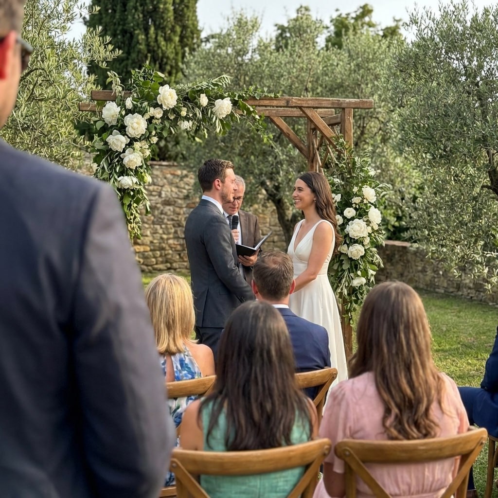
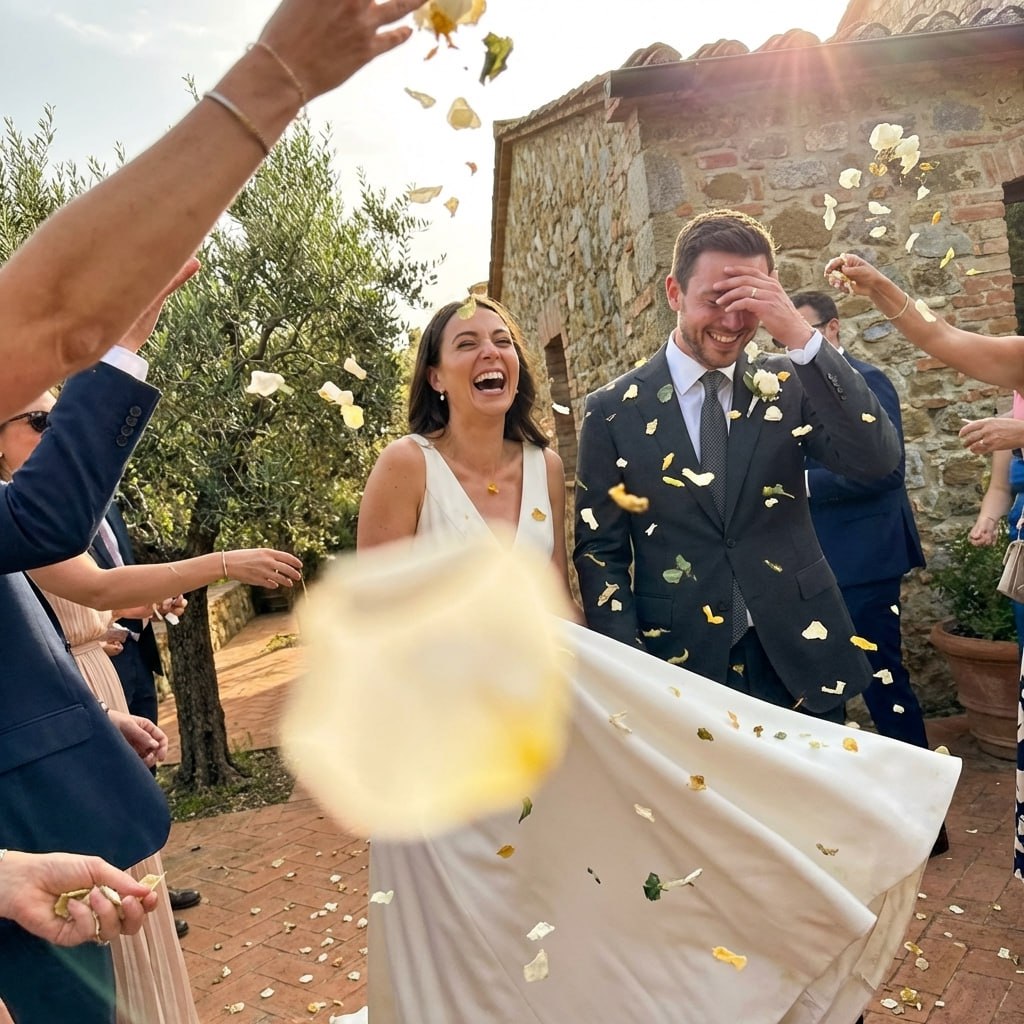
Real Fall Wedding Color Stories
Here is how real couples have applied these palettes to create unforgettable autumn celebrations.
Mia and Thomas, October in Vermont
They draped copper-hammered lanterns along the aisle and filled galvanized tubs with sunflowers, rust dahlias, and orange ranunculus. Bridesmaids wore mismatched terra-cotta and rust chiffon. The foliage backdrop made every photo look like a painting.
Priya and James, November in Napa
Deep emerald velvet linens against the bare vineyard vines. Bridesmaid gowns in forest green satin. Deep burgundy roses and teal-sprayed greenery in the centerpieces. Gold pillar candles and amber string lights completed the jewel-tone tableau.
Elena and Marcus, October in Charleston
A dark, moody ceremony inside a historic mansion. Black-magic roses and deep plum calla lilies in low vessels. Warm candlelight created a chiaroscuro effect that their photographer called the most dramatic reception she had ever shot.
Fall Wedding Colors by Month
September
Early fall still carries summer warmth. Palettes can lean brighter: golden yellow, warm peach, terracotta, and sage. Florals are abundant, and outdoor ceremonies benefit from rich golden-hour light.
October
Peak fall season. Every palette type works. Foliage provides a natural backdrop that elevates any color story. This is the best month for warm jewel tones and dramatic moody palettes alike.
November
Late fall calls for deeper, richer colors as the landscape becomes sparse. Moody and jewel-tone palettes shine brightest. Indoor venues with candlelight are ideal for the darkest palette choices.
Bridesmaid Dress Colors for Fall Weddings
Bridesmaid attire is the most visible expression of your palette. Here are the strongest fall bridesmaid color picks, matched to each palette category.
Warm Palettes
Mismatched shades of the same warm family look stunning in group photos against foliage.
Neutral Palettes
Neutral bridesmaid gowns allow the bouquets and venue to carry the color story.
Jewel-Tone Palettes
Velvet bridesmaid dresses in jewel tones add texture and richness to fall photographs.
Moody Palettes
Mismatched dark gowns in a single color family (shades of burgundy to blush) are a signature moody look.
10 Common Fall Wedding Color Mistakes to Avoid
Even beautiful individual colors can fail as a wedding palette. Here are the most common pitfalls couples encounter when choosing fall wedding colors.
Choosing colors only from a phone screen
Colors look dramatically different on screen versus in fabric and print. Always request physical swatches from your florist, stationer, and bridal party vendor.
Using too many saturated colors
Five fully saturated fall colors will compete and exhaust the eye. Use 1-2 bold saturated colors and balance them with neutrals. The neutral is as important as the color.
Forgetting venue lighting
Warm incandescent lighting (string lights, candles) amplifies warm tones and mutes cool tones. Test fabric swatches under your actual venue lighting before finalizing.
Matching instead of coordinating
Exact color matching across flowers, fabric, and paper is nearly impossible and looks rigid. Coordinate within a color family, allowing natural variations in tone and saturation.
Ignoring seasonal flower availability
Your dream palette is only achievable if the flowers exist in those colors in your wedding month. Confirm specific flower availability with your florist 4-6 months ahead.
Using trendy colors without considering longevity
Ultra-trendy colors date quickly. Balance trend colors with classic anchors so your photos still feel beautiful in 10 years.
Choosing all warm or all cool tones
A palette with only warm colors can feel overwhelming. A palette with only cool tones can feel disconnected from autumn. Balance both temperatures.
Leaving metallics as an afterthought
Gold, copper, silver: the choice of metal accent affects every other color in your palette. Decide your metal early and keep it consistent across stationery, decor, and accessories.
Not testing bridesmaid colors on multiple skin tones
A color that looks stunning in isolation may not be universally flattering. Test bridesmaid dress swatches on multiple people with different complexions before committing.
Starting with Pinterest boards and ending there
Pinterest boards are excellent for inspiration but must be translated into an actual color palette with specific hex codes or physical swatches that you then share with every vendor.
How to Communicate Your Fall Palette to Every Vendor
A palette only works if every vendor interprets it consistently. Here is the vendor-by-vendor communication guide to ensure your colors are cohesive from flowers to cake to stationery.
Florist
Bring physical fabric swatches and a printed palette card with hex codes. Ask to see sample arrangements in your specific colors before committing. Request to see the actual flowers in person, not just images.
Stationer
Share hex codes and physical color samples. Request a digital proof and a printed proof before approving the final order. Ink and paper absorb color differently, so digital proofs alone are insufficient.
Cake Designer
Bring photos of your palette in situ (bridesmaid gowns, floral arrangements) so the cake color matches the palette in context, not just in isolation. Fondant and buttercream absorb color differently.
Caterer and Linen Rental
Request linen swatches in your primary and neutral colors. Layer swatches on the actual table surfaces at your venue if possible. Linen color shifts dramatically under venue lighting.
Photographer
Share your palette document before the wedding. Discuss white balance settings for your specific color story. Ask how they handle deep saturated colors (like burgundy or jewel tones) in post-processing.
Bridal Party
Create a palette guide document with hex codes, specific color names, and approved vendor links or store options. Do not rely on descriptive color names alone: "dusty rose" means different things to different people.
Explore the Full Fall Wedding Color Cluster
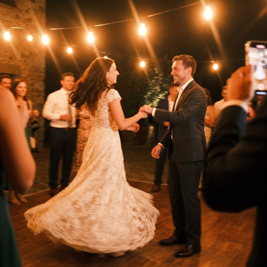
First dance
You guys!!
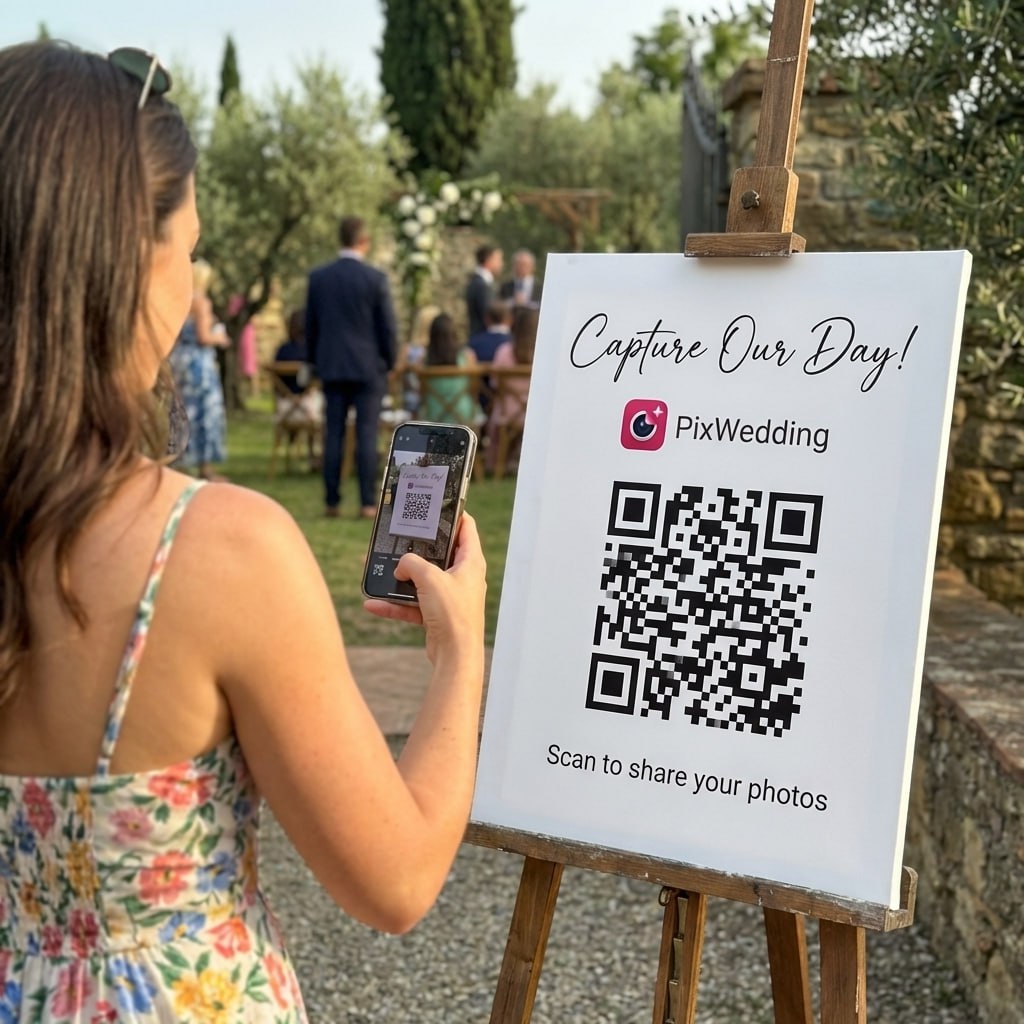
Fall colors look incredible in guest photos.
Jewel tones, warm neutrals, foliage backdrops - your palette shines from every angle. Give guests one QR code and receive all those shots in a single shared album.
From Mom
Scan to join the album
No app, no account
UPLOADING
Saving your moment
THE ALBUM
Emma & Jack
June 21, 2026
647 photos · 95 guests
SCAN TO TRY
pix.wedding/
your-wedding
How to Choose Your Fall Wedding Color Palette
Choosing fall wedding colors starts with your venue. Barn and farm venues naturally lean toward warm earthy tones: rust, terracotta, wheat, and cognac. Vineyard ceremonies call for richly saturated jewel tones that mirror the grape harvest. Urban ballrooms can handle dramatic moody palettes without the natural backdrop to compete with. Outdoor garden venues pair beautifully with neutral sage and cream combinations.
Next, consider your wedding month. September weddings catch early fall light and can still incorporate some warmth from late-summer florals. October is peak palette season: every warm and jewel tone looks at home against peak foliage. November calls for the deepest, moodiest tones as daylight shortens and the landscape becomes more spare.
Finally, think about your personal style. Warm palettes feel cozy and celebratory. Neutral palettes feel refined and timeless. Jewel tones feel luxurious and bold. Moody palettes feel dramatic and editorial. There is no wrong answer, only the wrong answer for you.
- •Start with your venue: barn, vineyard, ballroom, or garden each suit different palettes
- •Match depth to your month: September can be brighter, November calls for deeper tones
- •Choose one dominant color, one complement, and one or two accents
- •Test colors in fall light by looking at fabric swatches outdoors at the same time of day as your ceremony
- •Ensure your palette works across flowers, stationery, cake, attire, and decor simultaneously
Fall Wedding Colors by Category: Warm, Neutral, Jewel, and Moody
Warm fall wedding colors are the classic choice: burnt orange, terracotta, rust, pumpkin, amber, and golden yellow. These shades feel inherently seasonal and pair with natural wood, copper metals, and harvest-inspired florals like sunflowers, marigolds, and dahlias.
Neutral fall palettes include stone, taupe, cream, sage, dusty mauve, and champagne. These work in any venue and are particularly popular with couples who want their photos to feel timeless rather than of-the-moment. Neutral palettes are endlessly versatile across floral styles and attire.
Jewel-tone fall palettes, such as emerald and gold, sapphire and copper, or plum and blush, bring richness and visual drama. These colors feel luxurious against autumn foliage and candlelight, and they photograph with incredible depth.
Moody fall palettes push further into darkness: midnight burgundy, smoked plum, gothic garden deep violet, and obsidian with rose accents. These palettes suit evening receptions, particularly with candlelight and drapery.
Bridesmaid Dress Recommendations for Fall Wedding Colors
Bridesmaid attire is one of the most visible expressions of your wedding palette. For warm fall palettes, consider dusty rose, terracotta, rust, or champagne gowns. Jenny Yoo, Birdy Grey, and Azazie all offer excellent fall color options at varied price points.
For jewel-tone palettes, deep emerald, navy, plum, and sapphire bridesmaid gowns photograph beautifully. Velvet bridesmaid dresses in jewel tones have become a signature fall wedding trend that adds texture and richness.
For moody palettes, forest green, deep burgundy, dark navy, and black bridesmaid gowns all work. Mismatched shades within the same color family add visual interest and allow each bridesmaid to wear a shade that flatters her complexion.
Explore more free wedding tools
Everything you need to make your wedding day stress-free and unforgettable.
QR Sticker Designer
Design custom print-ready stickers.
Hashtag Generator
Create unique wedding hashtags.
How to Collect Guest Photos
5 methods ranked by participation rate and ease.
Get Photos After the Wedding
Message templates to gather guest photos post-wedding.
Share Wedding Photos with Guests
Compare every sharing platform by ease and participation.
Best Way to Get Guest Photos
The single method with the highest participation rate.
How to Make a Shared Wedding Album
Step-by-step setup for every platform.
Alternative to Disposable Cameras
Better, cheaper options than disposable cameras.
Fall Wedding Colors FAQ
Everything you need to know about our free tools and how they help your wedding day.
The top fall wedding colors for 2026 include warm terracotta and burnt orange, deep jewel tones like emerald and sapphire, moody burgundy and plum combinations, and neutral cream-and-sage pairings. Couples are also gravitating toward unexpected combos like cobalt blue with rust orange.
Warm jewel tones, particularly burgundy, deep plum, and forest green, photograph especially well in fall light. These colors contrast beautifully with golden-hour sunlight and natural foliage. Avoid pure white and very pale pastels, which can blow out in bright autumn sun. Neutrals like cream and sage also photograph cleanly.
Most fall wedding palettes work best with 3-5 colors: one dominant color (60%), one secondary color (30%), and one or two accents (10%). Having too many colors can look chaotic in photos. A typical structure would be one deep anchor color, one mid-tone complement, and one light neutral plus a metallic accent.
You can, but muted pastels work better than bright ones. Dusty rose, sage, dusty blue, and lavender all read well in autumn contexts without fighting the natural fall color story. Bright neon pastels will look out of place against golden foliage and warm autumnal decor.
Fall-blooming flowers like dahlias, chrysanthemums, marigolds, sunflowers, and calla lilies pair naturally with autumn palettes. Amaranth, dried pampas grass, billy ball flowers, and Japanese maple branches add textural depth. Roses, ranunculus, and anemones are widely available year-round and come in nearly every fall shade.
Top bridesmaid dress colors for fall include burgundy, rust, dusty rose, sage green, champagne, navy, and terracotta. For moody palettes, dark plum and forest green are stunning. Mismatched bridesmaid dresses in the same color family (e.g., varying shades of burgundy from wine to blush) are especially popular for fall.